Branding for Grubz
Grubz, an Asian fast-food restaurant, aimed to revitalize its brand to appear more organic, friendly, and welcoming. Our task was to create a fresh and engaging visual identity that would attract customers and communicate the essence of the brand.
Service
Re-Branding and
Visual Identity Design
Client
Grubz
Industry
Asian restaurant
Understanding the Vision
Grubz envisioned a brand that captures the vibrant and approachable nature of their cuisine. They wanted to ensure that their brand exuded warmth and friendliness while reflecting the authenticity of Asian fast food. Our goal was to translate this vision into a cohesive and appealing brand identity.
Our Process
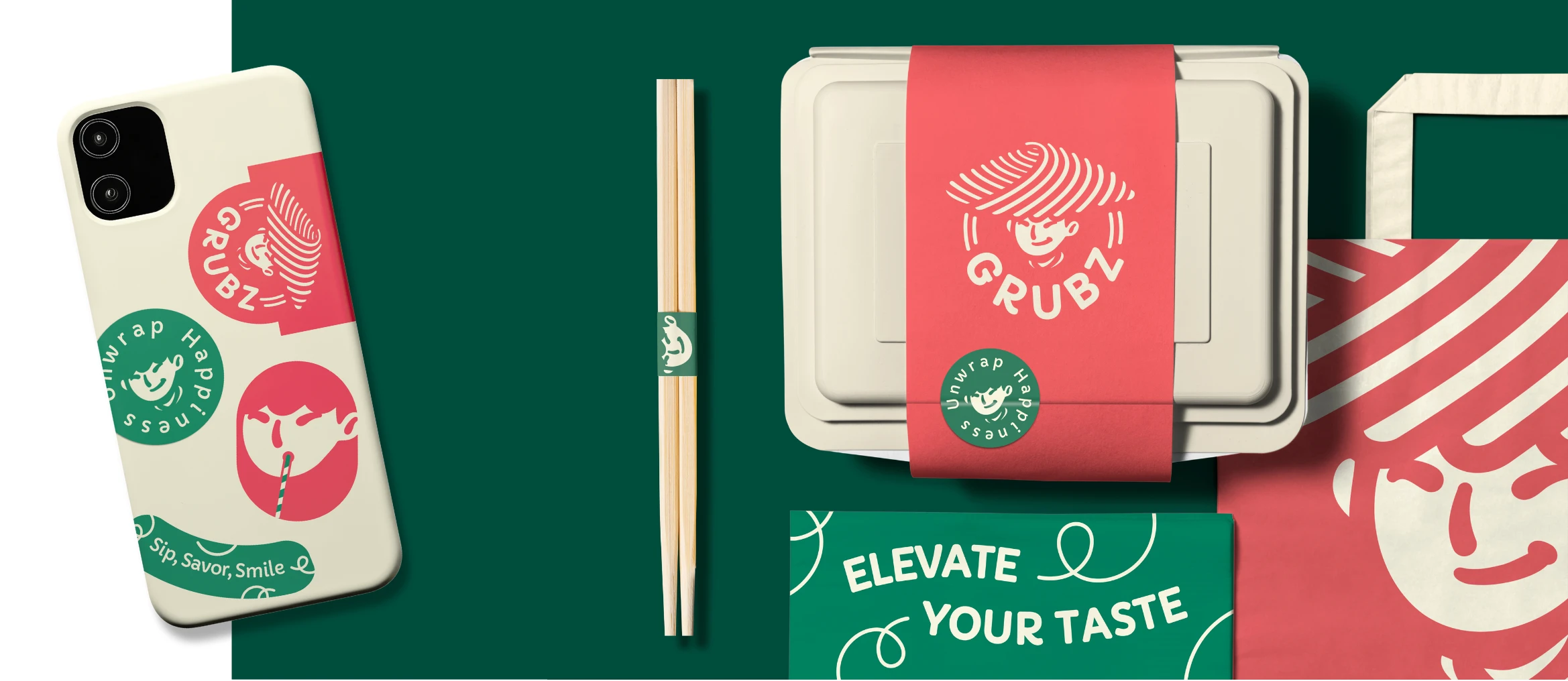
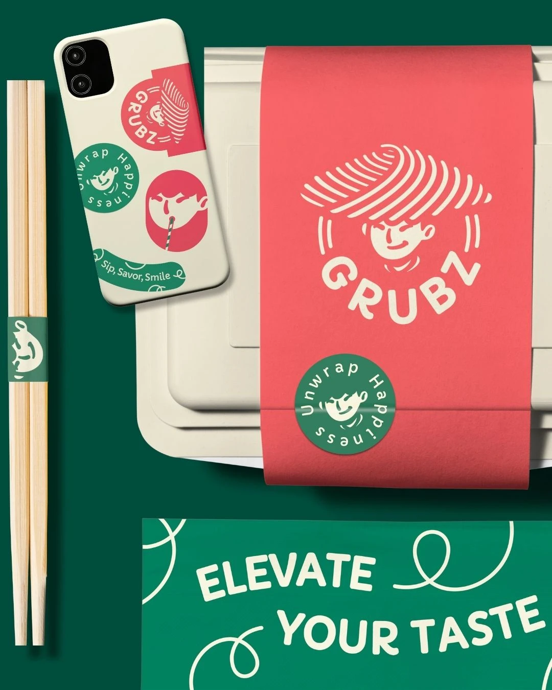
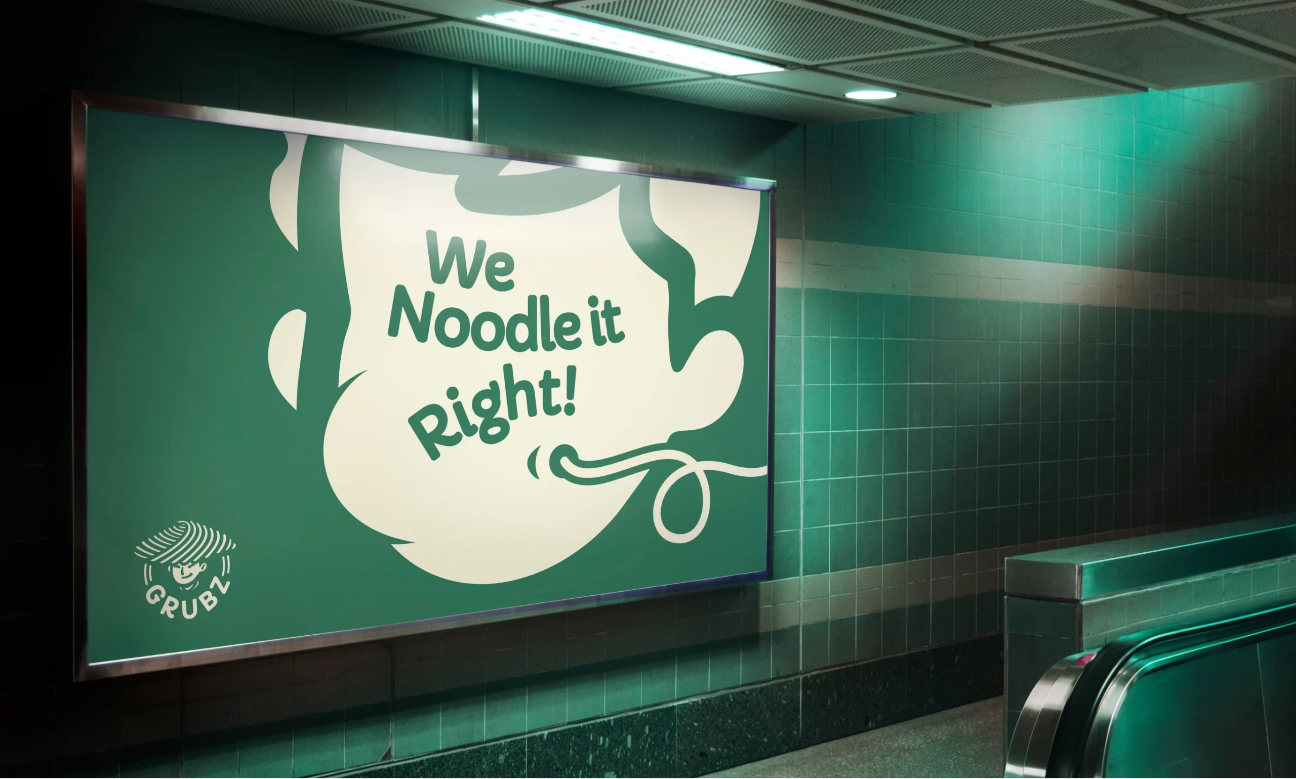
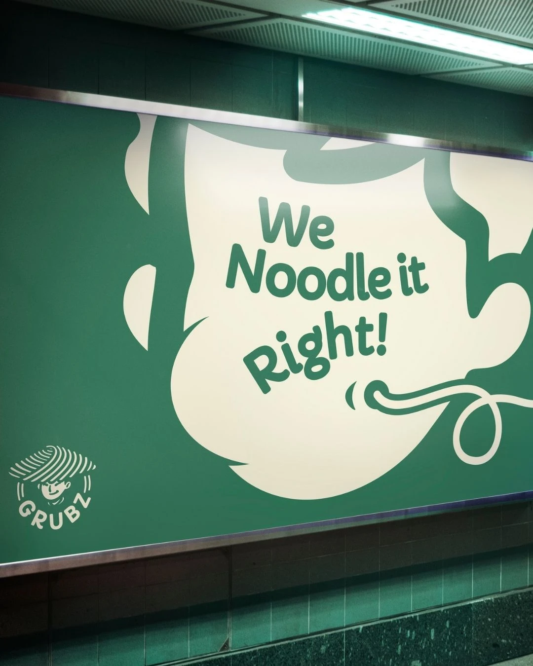
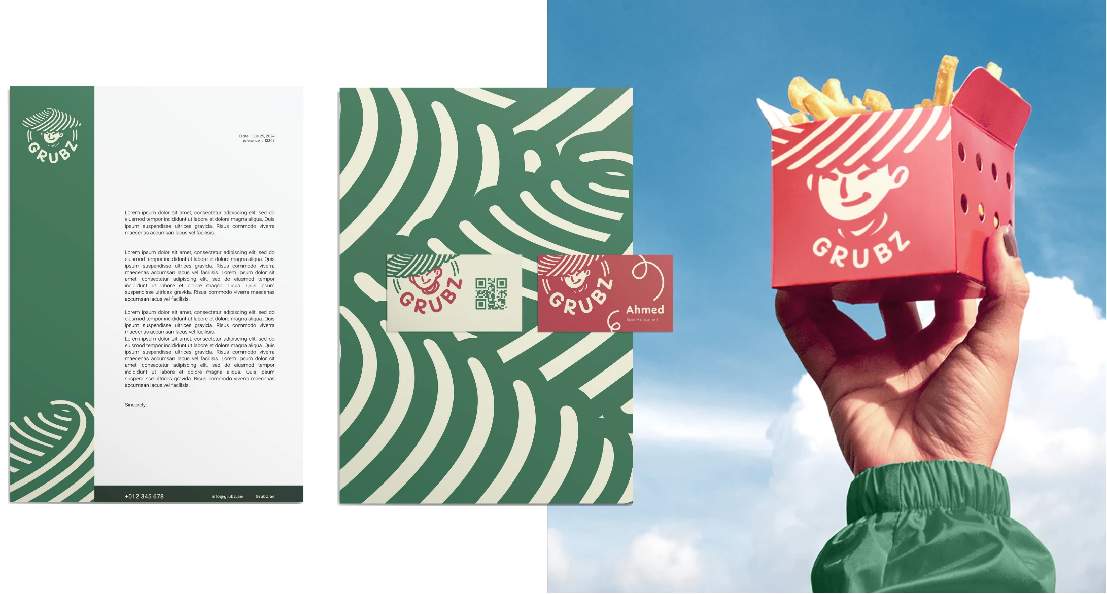
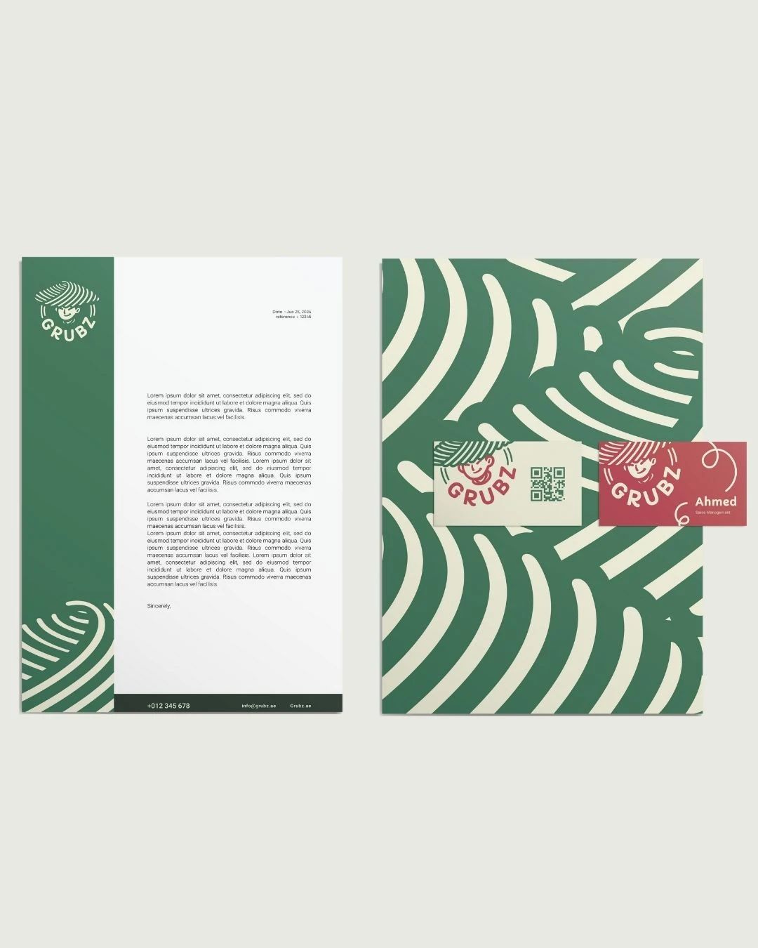
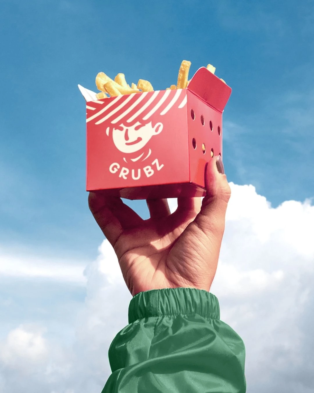
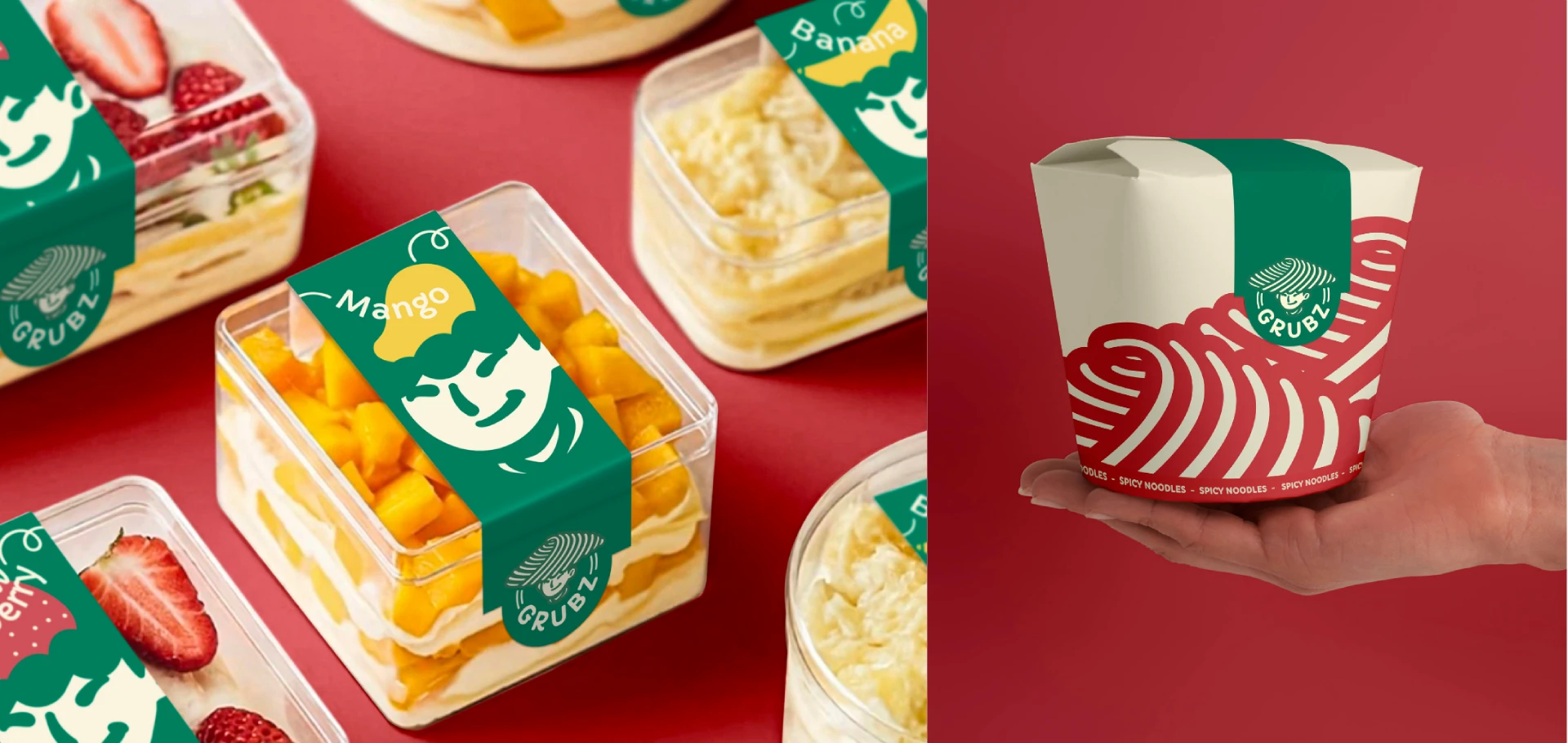
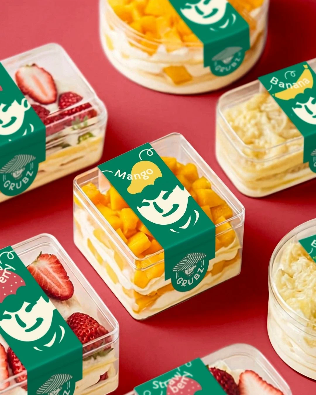
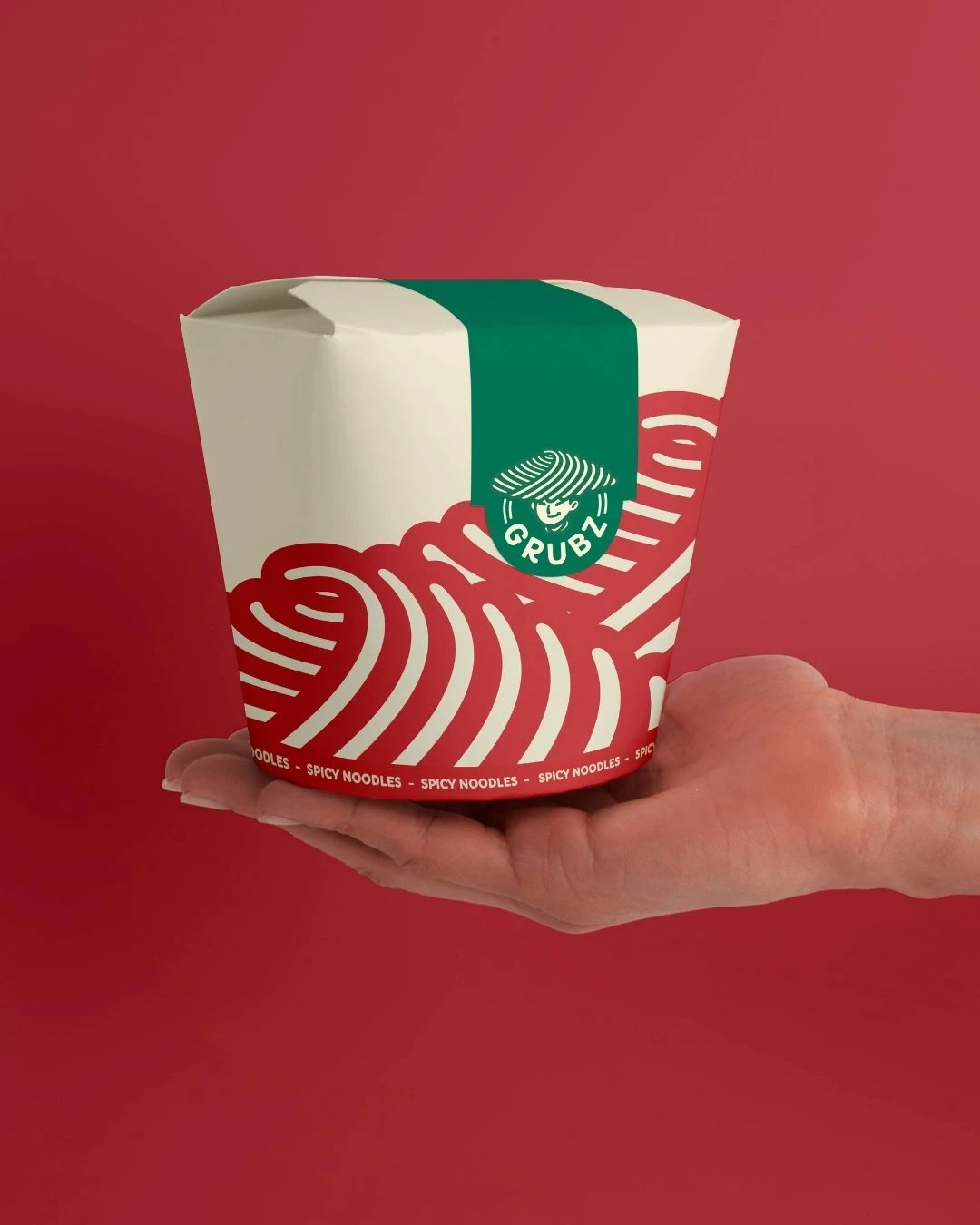
We created a minimal illustration of a young smiling Asian man wearing a hat resembling noodles, which became the centerpiece of the brand’s visual identity. This character embodies the fun and inviting nature of Grubz.
We chose red, light beige, and green as the primary colors. Red symbolizes energy and passion, light beige offers a sense of simplicity and warmth, and green evokes freshness and vitality.
The chosen font features curvy, noodle-like shapes, reinforcing the playful and organic feel of the brand. This typography style ensures consistency and enhances the overall theme.
Impact
The rebranding of Grubz successfully communicated its core values and vision. The welcoming and friendly visual identity attracted a broader customer base, increasing foot traffic and customer engagement. The cohesive use of colors and illustrations helped establish a strong and recognizable brand presence in the market. As a result, Grubz now stands out as a vibrant and approachable destination for Asian fast food lovers.
