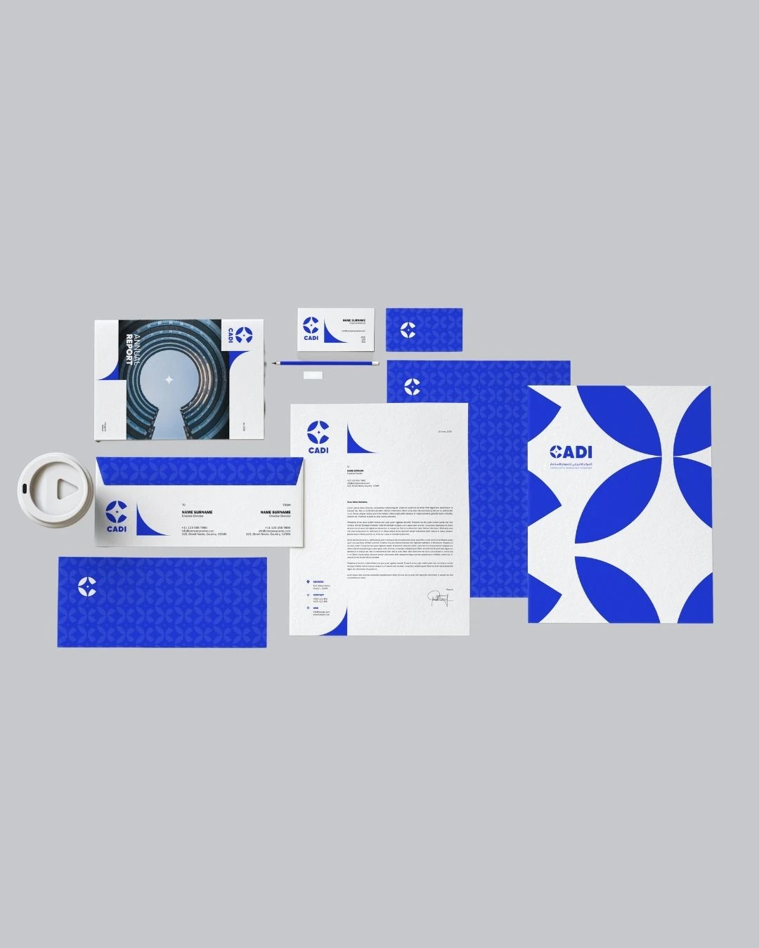
CADI - Accelerating African and Global Economic Development Rebranding
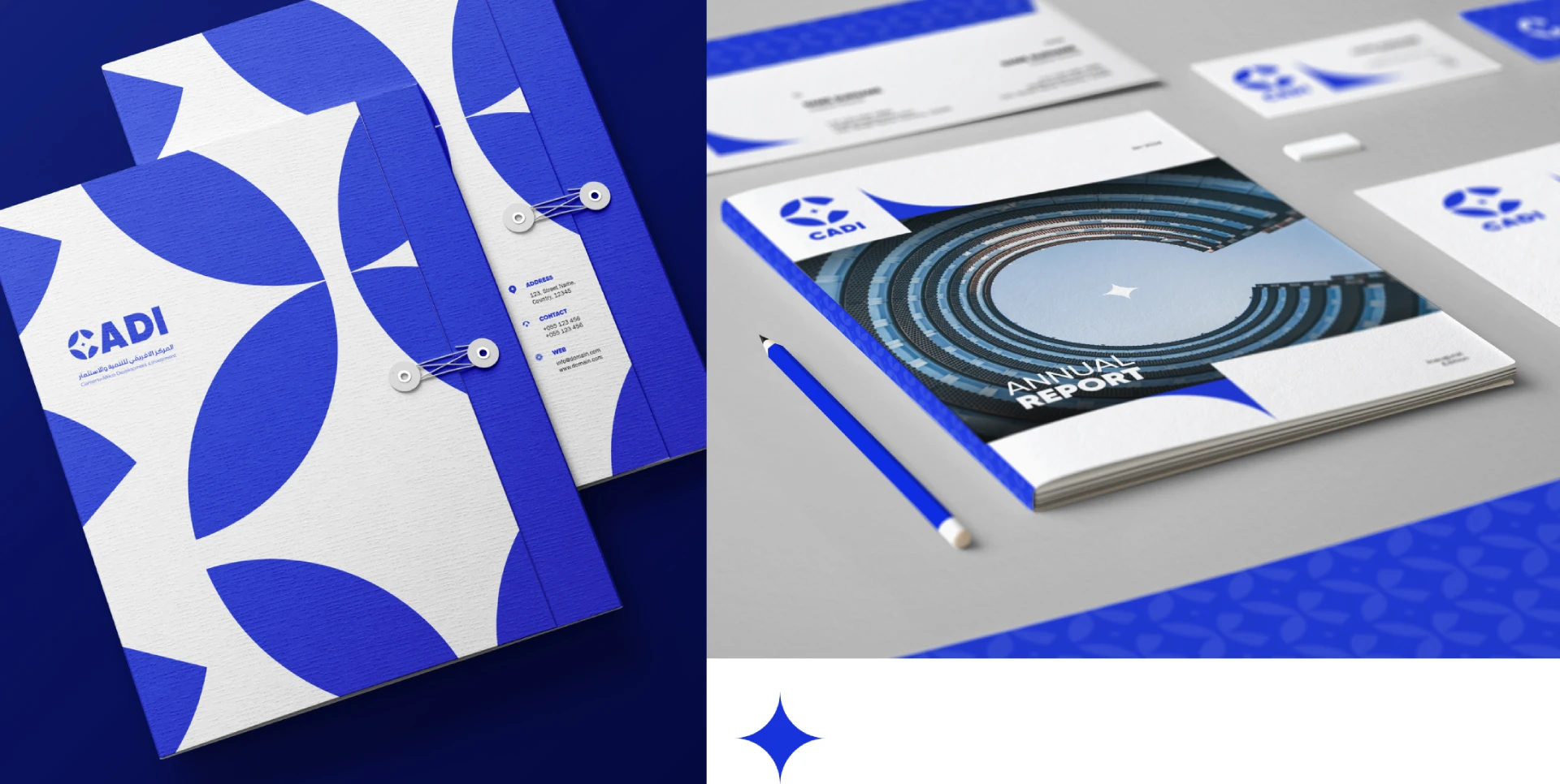
CADI, an organization dedicated to accelerating African and global economic development, sought a rebrand that would convey a minimal and corporate look while also reflecting African culture. Our mission was to create a professional and culturally resonant brand identity that would appeal to a global audience.
Service
Branding and Visual Identity Design
Client
CADI
Industry
Economic Development
Understanding the Vision
CADI envisioned a brand that seamlessly integrates a corporate aesthetic with elements that honor African heritage. They wanted to ensure their brand appeared professional and forward-thinking, yet deeply rooted in cultural identity. Our goal was to bring this vision to life with a clean and meaningful design.
Our Process
We started by understanding CADI’s mission, values, and the cultural nuances that needed to be represented. This research phase was crucial in developing concepts that balanced professionalism with cultural significance.
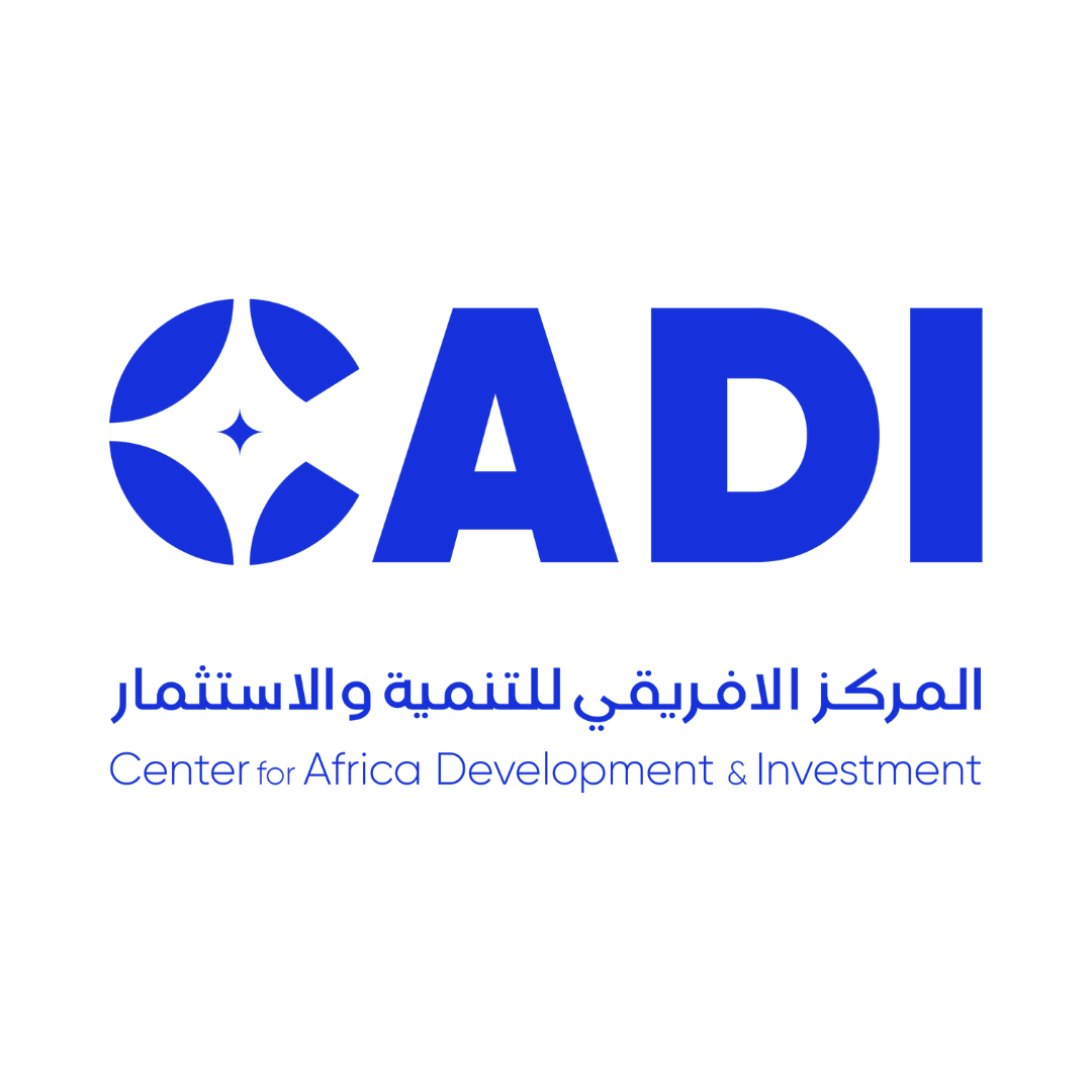
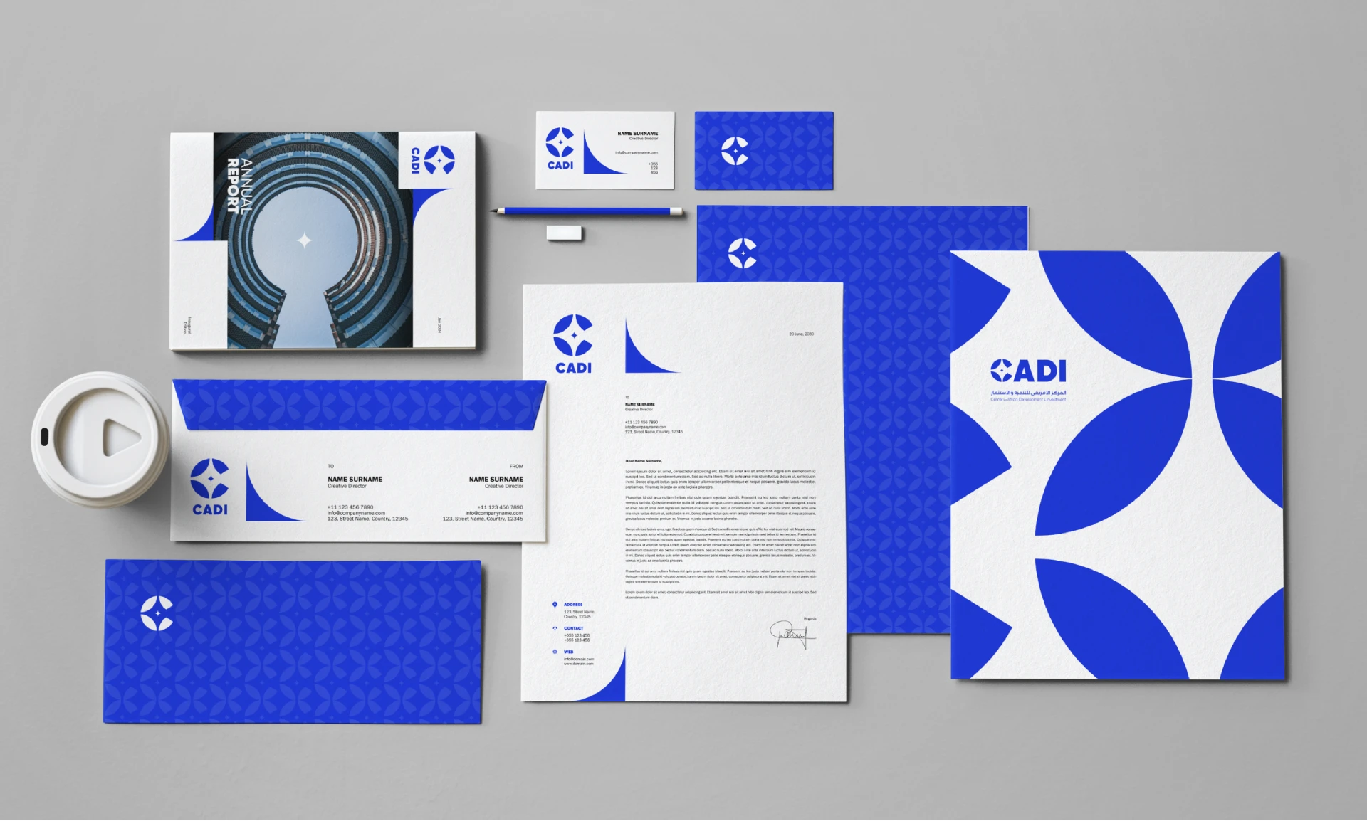
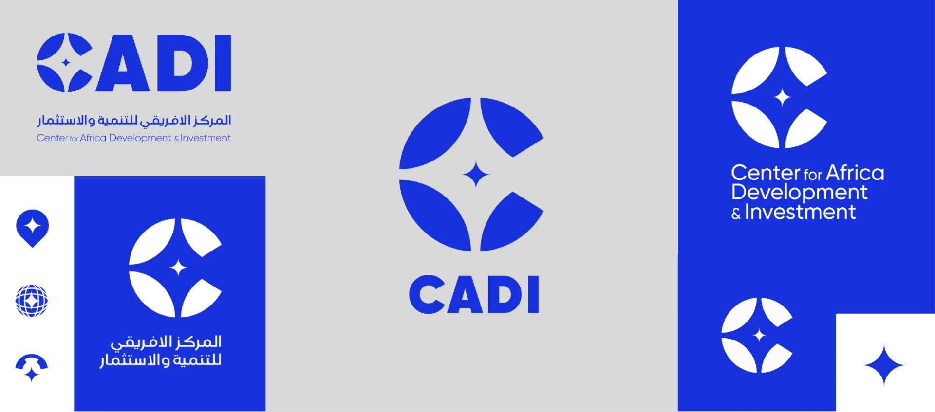
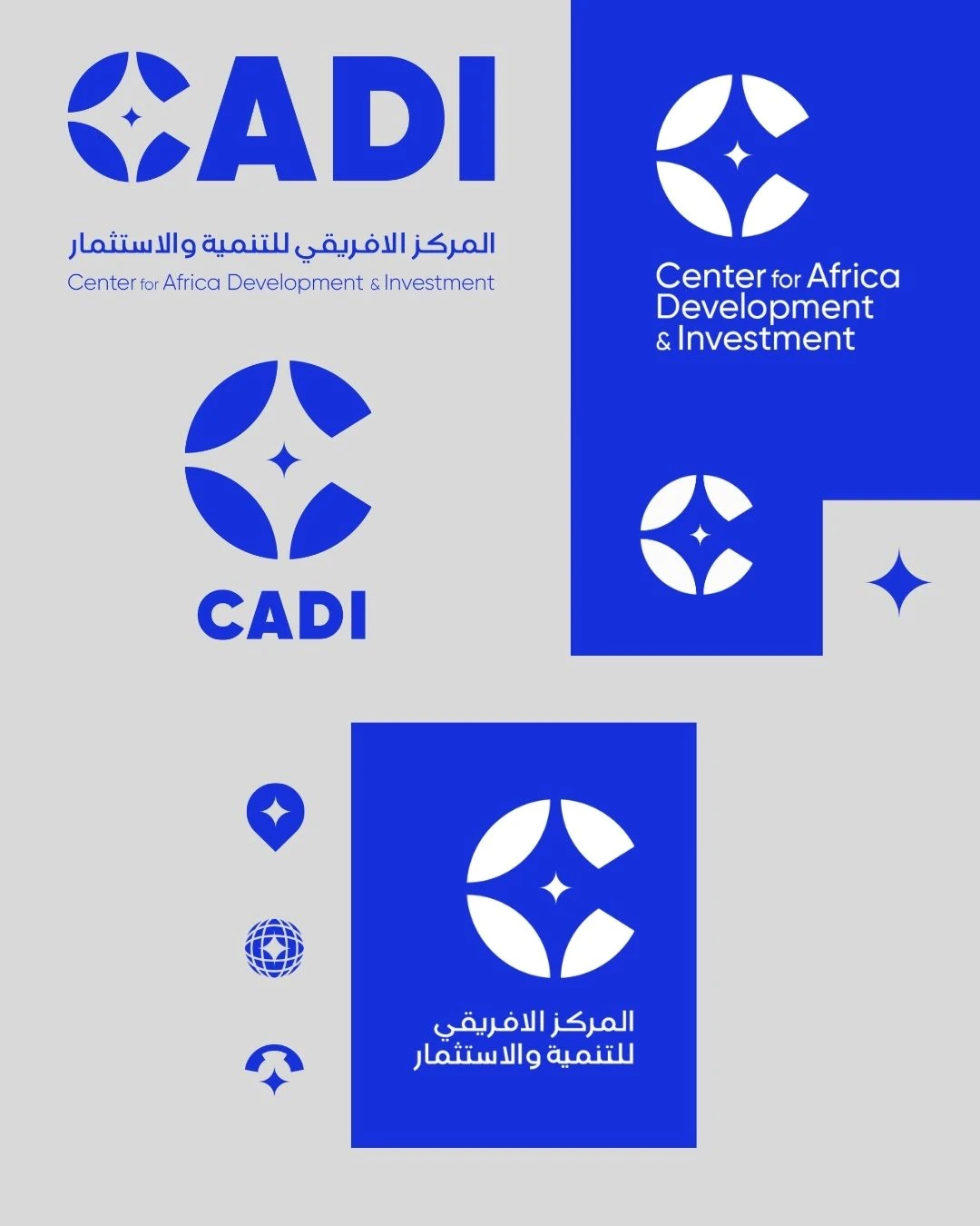
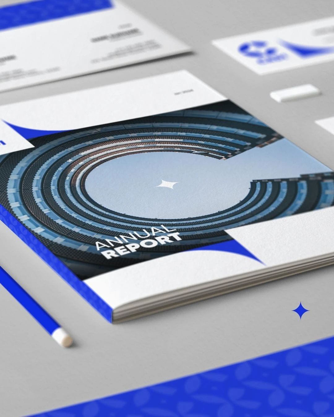
We designed a logo featuring a stylized letter “C” with a sparkling star in the middle. The “C” symbolizes CADI’s name and its commitment to continuous growth and development. The star represents guidance, excellence, and the bright future CADI aims to foster.
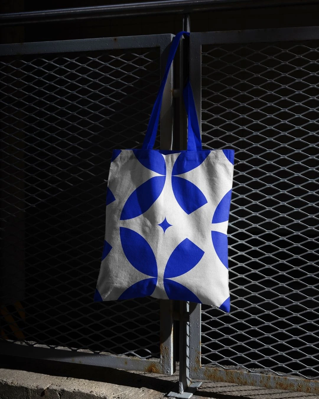
Moroccan blue was chosen as the primary color for its cultural richness and corporate appeal. This shade of blue conveys trust, stability, and depth, aligning with CADI’s mission and values while reflecting the vibrancy of African culture.

Impact
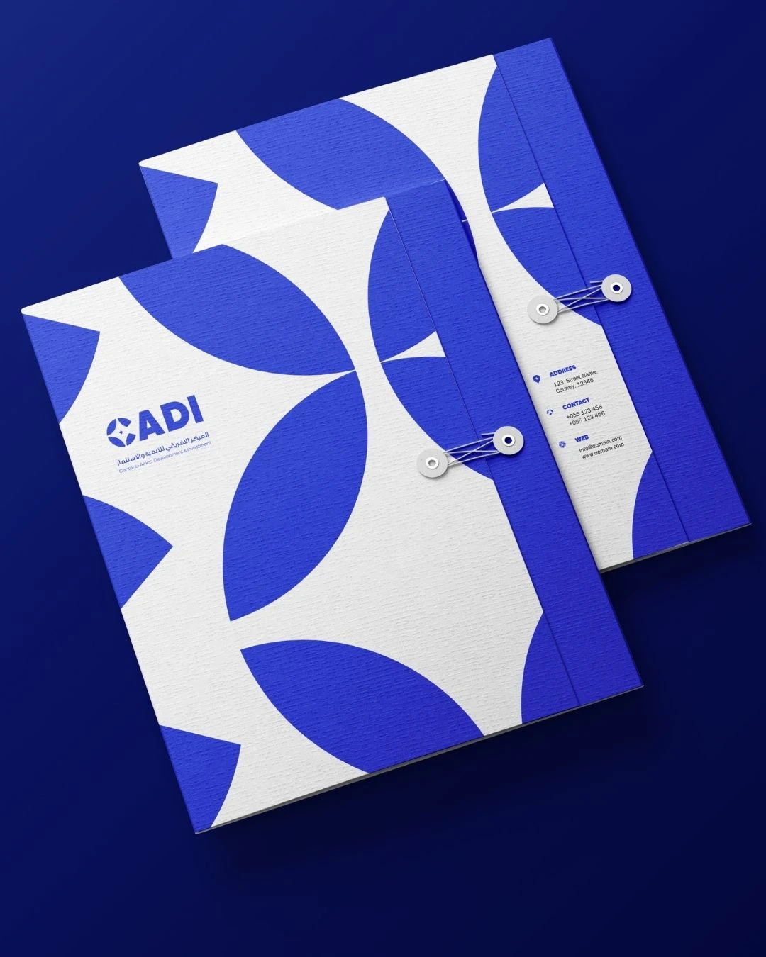
The rebranding of CADI successfully achieved a balance between corporate minimalism and cultural representation. The new brand identity effectively communicates CADI’s dedication to economic development and its cultural roots. The use of Moroccan blue and the symbolic logo have helped establish a strong, professional, and culturally significant brand presence. As a result, CADI is now better positioned to connect with a global audience while staying true to its African heritage.
